The good, the bad and the ugly: 2012 team kits
Hot stuff? Black and blue is bland on bland
The latest race content, interviews, features, reviews and expert buying guides, direct to your inbox!
You are now subscribed
Your newsletter sign-up was successful




Each year in January the professional peloton emerges from its winter hibernation with an explosion of colour as riders are paraded out onto stages across Europe to model their new kits. The design of its clothing reflects each team's personality and the image of its sponsors, forging a brand identity which will last the season and beyond. What do cycling fans have to look forward to in 2011?
Vacansoleil-DCM list Mosquera in 2011 squad despite doping cloud
Rabobank set to continue through to 2016
Astana confirm Tour Down Under Squad
HTC-Highroad unveils 2011 jersey design
Movistar team unveils 2011 kit design
Garmin-Cervelo reveal 2011 racing team kit
Greipel shows off new Omega Pharma-Lotto jersey
A first look at Team Leopard-Trek
Basso dreaming of Tour de France win
The pro peloton has seemingly rejected the red and black theme that has dominated team kits for the past two seasons. Instead, fans have been greeted with black and blue and a few retro throwbacks in a surprisingly conservative turn to the peloton's appearance. Gone are the days when the advent of digital sublimation made a bike race look like a clown convention. This year's theme is "keep it simple, stupid".
Cyclingnews has taken a look at what the teams will be wearing and scored each kit 1-5, (with 5 being the highest mark) on the following criteria: Visibility; Design and layout; Colour palette; Reflection of sponsor's identity; and Originality. Here's how they fare.
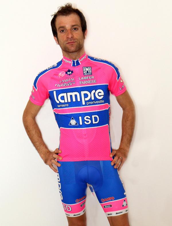
Lampre-ISD:
Visibility: Excuse me while my eyes recover from the shock. We think a season's supply of pain killers is in order. We can't give them full marks because visibility doesn't work when you've been blinded. 3
Design: Last year's design had nice cooperation between the jersey and shorts, with the unified blue center being accented by the neon pink shoulders and stripes on the shorts. This year's horizontal design is blocky, static and the pink overwhelming. 2
Colours: Neon pink isn't even the title sponsor's color. Who came up with this idea? Someone's five-year-old daughter? Or did the designers visit Willy Wonka and the Chocolate Factory and overdose on sugar? The combo vibrates in a way that's sure to incite rage and aggression. Maybe that's the point. 2
The latest race content, interviews, features, reviews and expert buying guides, direct to your inbox!
Sponsors: A sponsor's identity should be reflected in the team kit, not overwhelmed by it. Epic fail. 1
Originality: Maybe you have to be Italian to fully appreciate this one? 3
Total – 11/25
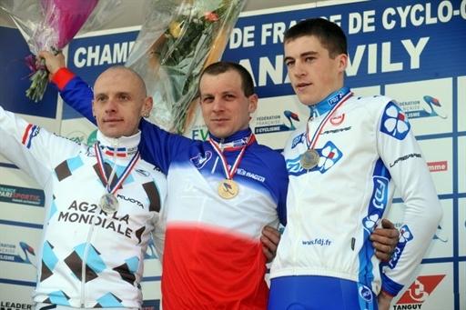
AG2R La Mondiale:
Design: Please go back to the 2009 kit, we're begging you. The logo is unattractive enough, so why repeat it? The only thing the brown shorts are useful for is hiding mud for John Gadret's cyclo-cross racing. 2
Colours: The use of a rather unfortunate shade of brown is never okay on human beings. Keep it for cows, floor stains and the odd piece of furniture, please. 1
Sponsors: It holds exactly true to title sponsor AG2R La Mondiale's corporate image, and that's the problem. The company is in the business of insurance and investment, not design. 3
Originality: Original, why yes. There are few who would want to sport this look. 3
Total – 12/25
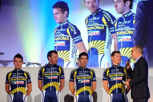
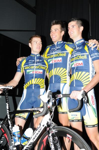
Vacansoleil-DCM:
Design: It's hard to believe they could make this one less exciting from last year's. Previously, the yellow sun rising on the jersey linked up nicely with the golden accents on the shorts, but this year's kit changes the side panel of the shorts to white, causing a disconnect. The rest of the layout is virtually unchanged aside from yellow bits at the armpits, and overall the layout is ordinary. 3
Colours: Blue skies, warm yellow sun. Enjoy your holiday in the great outdoors. The colours are exactly those of the title sponsor, but this year the dark blue is too dominant. 3
Sponsors: Vacansoleil are all about camping holidays all over Europe while DCM are a farming supply company. The logos are prominent enough but is the sun over the abdomen the best you could do? 3
Originality: This kit is nothing we haven't seen before. 2
Total – 13/25
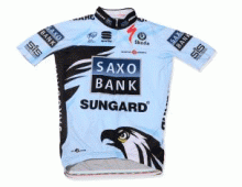
Saxo Bank-Sungard:
Design: If there's one element of this just can't take our eyes off, it's the hungry or even evil-looking eagle. Could it be coming out of the rider's shorts? It's just weird. The traditional wing design also makes a return. 2
Colours: The blue just isn't blue enough - the jersey looks as though it may have gone through the wash with a brand new pair of jeans. Or the Movistar jersey. 2
Sponsors: Investment bankers aren't really known for their personality, are they? 3
Originality: Bjarne Riis says it's "cool" but we're not so sure. Original – not really. 3
Total – 13/25
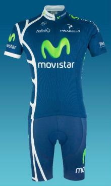
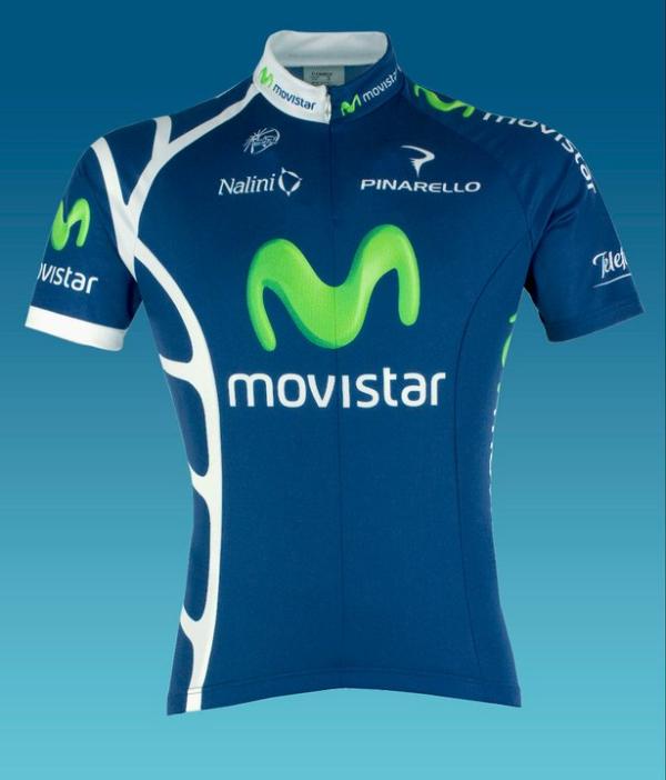
Movistar:
Design: The mobile phone company's ‘M' looks like a happy little glow worm, and that makes us smile. The uncluttered design is soothing, and the white ladder down the side adds visibility and distinction to an otherwise plain kit. 3
Colours: Again, the colours are the exact palette of the title sponsor and nothing more. 3
Sponsors: Movistar's operating company, Telefonica appears in smallish font on the left sleeve but the kit is very much in line with the Spanish mobile carrier. The glowing, wiggly M is the only thing that stands out, which is what a sponsor wants. 3
Originality: An extra point for the ladder, but this is mostly uninspiring. 3
Total – 14/25
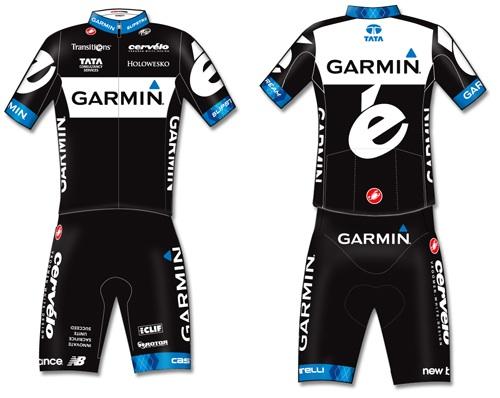
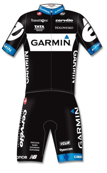
Garmin-Cervélo:
Design: The Cervélo and Garmin design teams fought and clearly Cervélo won. The traditional argyle design seen on past Garmin kits is used sparingly for the new team, featured only on the left sleeve, left short cuff and rear collar. We can only hope the team is greater than the sum of its parts because the kit design just isn't. 2
Colours: Can you ever really go wrong with black when it comes to fashion? 4
Sponsors: It's going to be hard to miss these guys with Cervélo's giant ‘é' on the backs of the jerseys but you can't help but think that the global positioning device company got lost in the merge. 3
Originality: If this is just a Cervélo TestTeam kit in disguise, it's not really original is it? 2
Total – 14/25
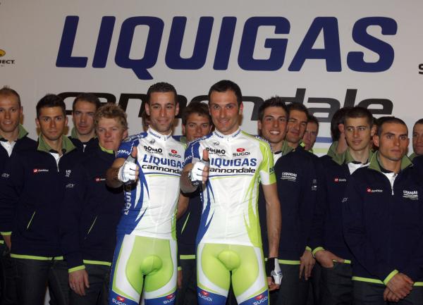
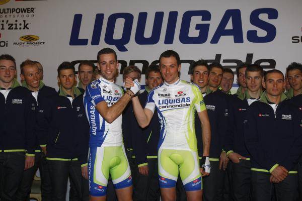
Liquigas-Cannondale:
Design: It's a lot more likeable, but it's lost some of the usual Euro charm this time around. Impressive unity between the shorts and jerseys - it's difficult to line up the stripes this well. 3
Colours: The hard-to-miss Kermit the frog green is not as prominent so overall, it's nowhere near as jarring. But what's with the green crotch on the shorts? Thank you. 4
Sponsors: The poisonous green is the corporate colour for Liquigas, so we can't fault the team for it. They've reduced its presence this year, but aside from the logo, they've failed fill that gap with Cannondale's brand identity. 2
Originality: Last season's greener-than-green get-up was original. This one just blends in a little bit more. 3
Total – 16/25
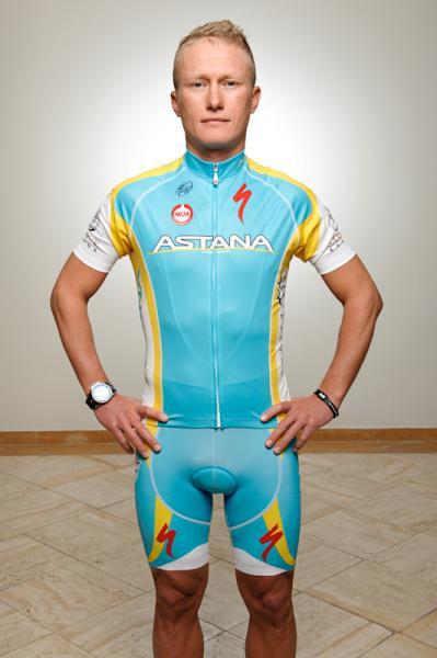
Astana:
Design: The sun design found on Kazakhstan's official decoration that has been featured in the past has disappeared. We wonder how the 11 Kazakhstani members of the team feel about that? Other than that, it's just last year's kit. 3
Colours: The national colours of Kazakhstan aren't for everyone. To some the opposing aqua and yellow can be dizzying, to others its calming. There's no denying the colour combination stands out, however. 3
Sponsors: The Astana team's identity is more that of Kazakhstan rather than the budding economic centre, but they do an excellent job of letting you know where the money's coming from. 4
Originality: It's the Kazakhstan flag, now minus the little sun. 2
Total – 14/25
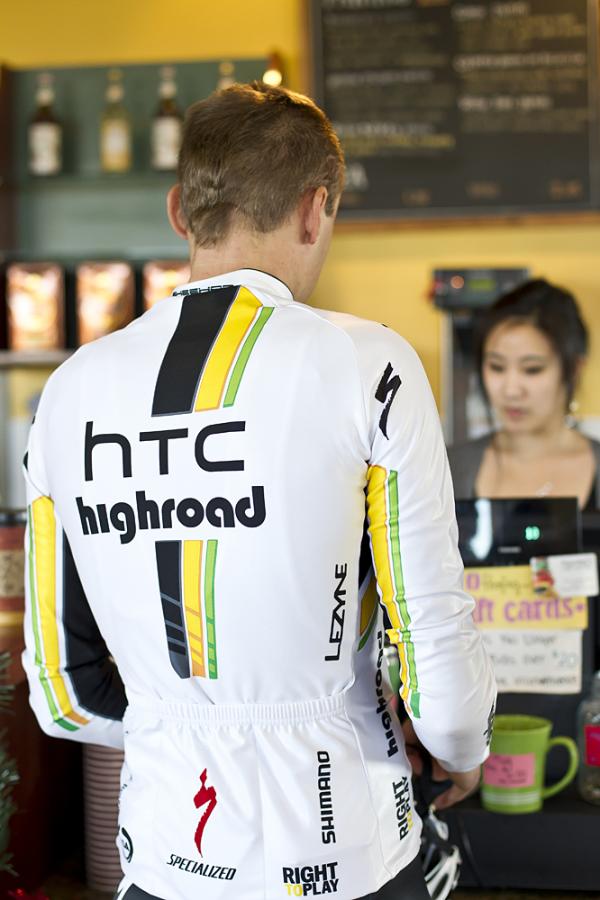
HTC-Highroad:
Design: This year's kit has been pared back, and for the better, on previous years with a simple black, yellow and green vertical stripe running through the jersey. Gone is any hint of the faux-abdominal muscles, and for that we say a big 'thank you'. And thanks, too, for choosing black shorts considering how see-through the jerseys are. 4
Colours: The white is good. Although we can't help but think they've been inspired by the past. See below. 3
Sponsors: Columbia are gone so it's all about phone manufacturer HTC. Never sure about the Highroad font though – it's so very 1970's – and not in a good way. 3
Originality: It's rare that this type of green is okay but without it, this kit would almost be the old Renault Efl get-up. 3
Total – 17/25
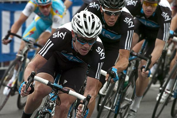
Team Sky:
Design: Very little has changed with the design. It's simple, clean and uncluttered but we've been down that road already. 3
Colours: Black, blue and white - Team Sky did it first and others followed, but that doesn't make it extraordinary. 3
Sponsors: Yep, that's the giant tv channel on the front. 4
Originality: These guys started the colour trend so bonus points. 4
Total – 17/25
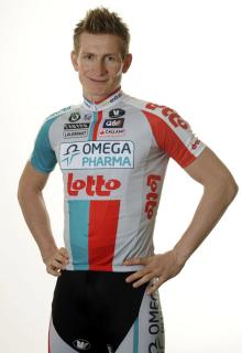
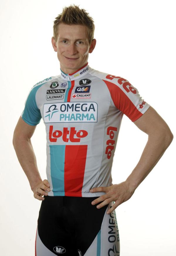
Omega Pharma-Lotto:
Design: The design, like HTC's, takes the stripes from the sides and places them in the center of the jersey, but otherwise the logo placement is quite similar. We're grateful for the continuation of the modest black front panel on the shorts. 4
Colours: The classic colors get a lighter treatment this year, with a Carolina blue and cherry red mix. The Omega Pharma logo pops better thanks to the gray background, but we fear the combination will appear drab in the peloton. 3
Sponsors: Omega Pharma and Lotto swap places on the side panels of the jerseys and on the legs of the shorts – both brands are prominent, and the Omega Pharma logo is better accentuated this year. 4
Originality: The Rapha Focus cyclo-cross team did those colours first. 3
Total – 18/25
Team BMC:
Visibility: Persistence pays! Last season there was a slight issue differentiating BMC, RadioShack and Caisse d'Epargne – not this year. 4
Design: There isn't that much change on the jersey but the black side swatch on the shorts has shrunk so there's more red. Shame the jersey features yet another example of a horiztonal bar. 4
Colours: This shade of crimson is hard to miss – we like it. 4
Sponsors: The design is conservative, but true to form. 4
Originality: Hard to say it's an original when it looked so similar to RadioShack's last season. 2
Total – 18/25
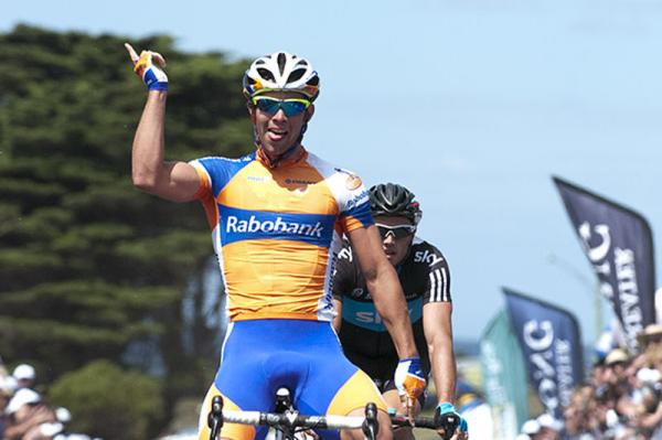
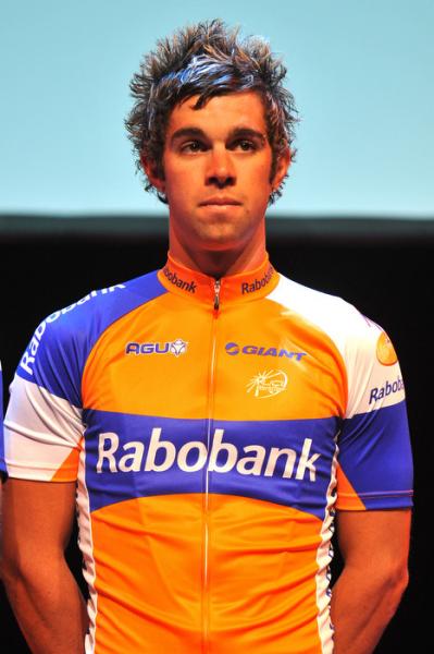
Rabobank:
Design: The blue, horizontal stripe has been hitched up so it's now more centred and there's less white on their 2011 design. The uncomplicated, bold swatches of colour reflect the simplied, retro theme that has permeated the peloton. 4
Colours: We know it's a Dutch team and orange is the national colour but really, it rarely looks good on anyone. 3
Sponsors: An accurate, undeniable reflection of Rabobank's corporate theme. 5
Originality: We would like a word with whoever sent the memo out again this year suggesting horizontal bars across the chest are a good idea. 2
Total – 19/25
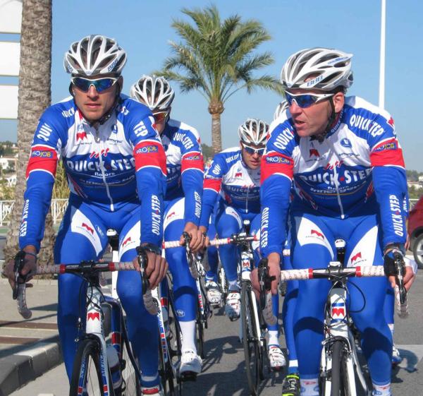
Quick Step:
Design: Slight change on last year's design most notably with the red ribbing on the side seams of the jersey. Maybe it will make the team go faster? 3
Colours: It was good last season, and just as good now. 4
Sponsors: Unlike a lot of other teams, these guys choose to spell out what their sponsors do: flooring and mattresses. 5
Originality: It's not going to change the world, but it works. 3
Total – 19/25
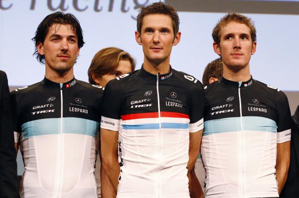
Leopard Trek:
Design: Simplicity is at the heart of creativity. Debate on the internet has been heated – it seems as though the punters either love it or loathe it. Some have even suggested the kit will be embraced by those ‘iPad-loving types'. 5
Colours: The blue, black and white horizontal stripe nods to the past with a simple, almost retro design – and not a spot in sight! But these are the most common colours in the peloton this season so points off. 3
Sponsors: What sponsors? There is a lot of bare space on the jersey and perhaps it will be covered up by sponsors down the track but for now, any logos are appearing minimalistic on the top black stripe. At least it's not in your face. 4
Originality: For now, these guys stand alone but we can't help thinking we've seen something similar before. 3
Total – 19/25
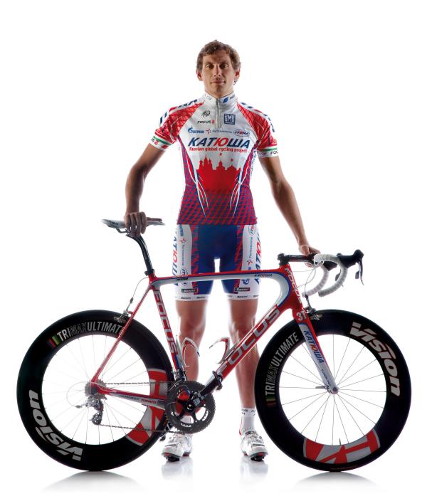
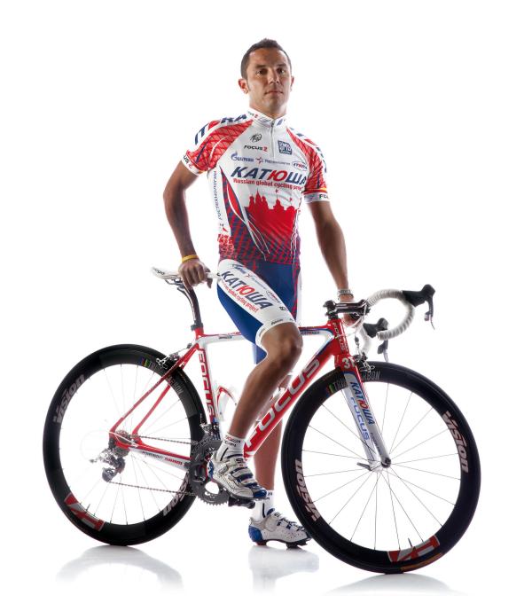
Katusha:
Visibility: There may be the odd red shoulder in the peloton in 2011 but these guys will still manage to be highly visible. 4
Design: It was blue, now it's red. The Russian cityscape just works, but the shift from a blue to red jersey now means that the shorts don't quite match. 3
Colours: The high contrast, complimentary colour scheme will always be a winner. 4
Sponsors: Katusha is owned by a conglomerate so branding isn't really an issue. But there's no mistaking this is a Russian team. 5
Originality: Sure is! 5
Total – 21/25
Euskaltel-Euskadi:
Visibility: Too much orange is never enough. 5
Design: This is one example of black shorts working with a jersey. 4
Colours: It may be orange however, without it we would never have had the giggles from Matthew Lloyd's expression from last year's Tour de France – "bleeding carrots". 4
Sponsors: You will never be left in any doubt that these guys are from the Basque region of Spain. 5
Originality: Who else wears this much orange? 4
Total – 22/25
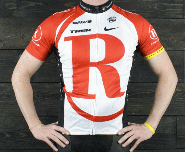
Team RadioShack:
Design: Following in the footsteps of Cervélo, the single letter dominates the jersey, but does so less elegantly than its predecessor. Other than that, the overall design is quite simple but effective. 4
Colours: Red and white stands out. But the squad could be confused for ambulance men. As traditional, the yellow Livestrong band appears on the left sleeve. 4
Sponsors: If RadioShack are unhappy with their exposure here, they're hard to please. The giant Nissan logo on the back of the shorts is hard to miss, too. 5
Originality: Typography - very design-y. 5
Total – 23/25
As a sports journalist and producer since 1997, Jane has covered Olympic and Commonwealth Games, rugby league, motorsport, cricket, surfing, triathlon, rugby union, and golf for print, radio, television and online. However her enduring passion has been cycling.
Jane is a former Australian Editor of Cyclingnews from 2011 to 2013 and continues to freelance within the cycling industry.

