2021 WorldTour team kits: The definitive ranking
A wide range of preferences for colours, patterns and branding in the peloton
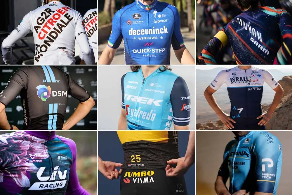
The new season is upon us, and with that comes the annual helping of wildly subjective opinions about the all-important and not-at-all superficial issue of team kits.
Rather than remaining above the fray, here at Cyclingnews we're wading knee deep into the debate. Each of our staff members has graded all the WorldTour kits, and we've aggregated the scores to produce what we're not-so-confidently calling a 'definitive' Cyclingnews ranking.
The ranking runs from 25 (worst) to 1 (best). It comprises all kits from men's and women's WorldTour teams - there are 28 teams in total, but three share kits for their men's and women's squads.

Consensus was hard to come by - even our lowest-ranked kit snuck into someone's top five - and we're sure our readers will have their own passionate views, so have your say in the comments section below.
25: Intermarché-Wanty-Gobert
The Belgian team, who have grabbed the old CCC Team's licence, enter the WorldTour with a kit that remains true to their old colours of blue, white, and neon green. One of us loved it, the rest of us hated it, so the newcomers sit rock bottom.
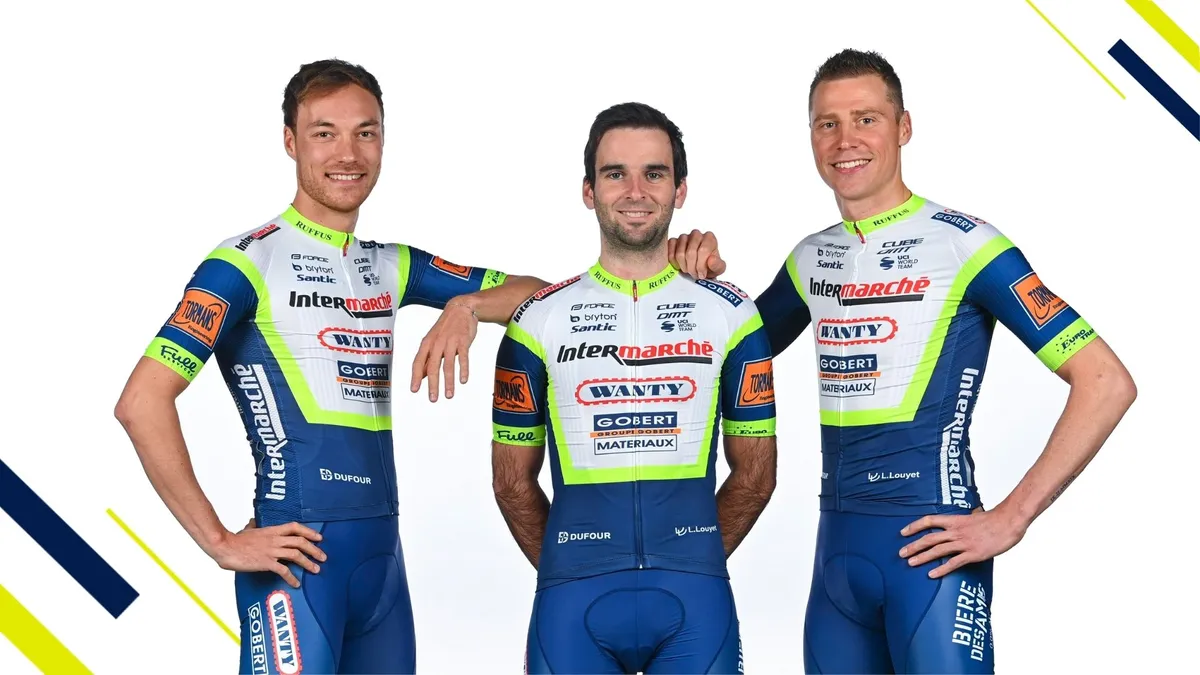
- I like it: Gotta love the attempt at motorsports branding here with 'sponsor soup'. Who cares if it is a jumble of company names; it's easy to spot in the peloton! (JT)
- I don't: Looks like a ProConti kit in a WorldTour league. (DB)
24: Team BikeExchange
A radical departure for the Australian team formerly known as Mitchelton-Scott, with Bianchi turquoise replacing the brighter green/yellow flashes of previous years. It's predominantly white and black - definitely not the pink of Manuel Fundación.


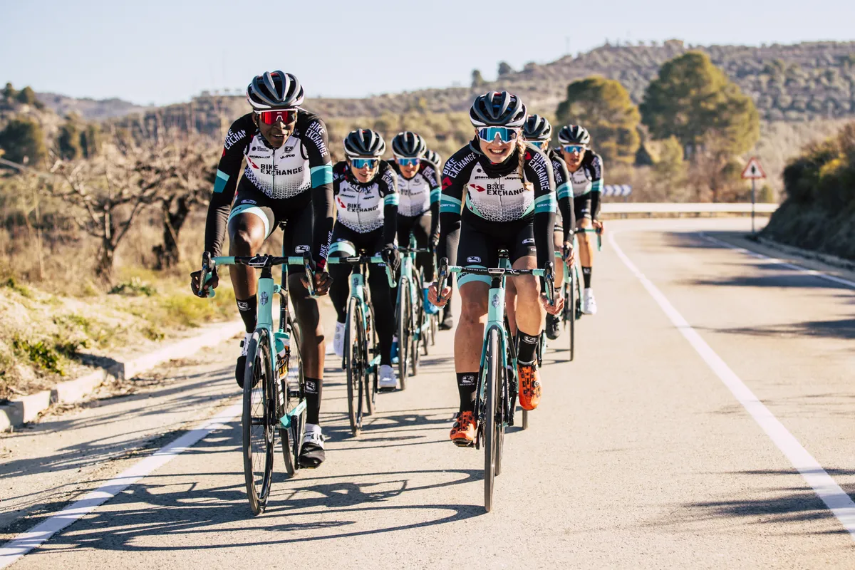

- I like it: The Australian team have integrated the Bianchi celeste pretty well but overall the kit lacks flair. (SF)
- I don't: Black and white is an extremely boring colour scheme, and this just has that corporate look about it, too. (DO)
23: Deceuninck-QuickStep
Blue has been a staple of the long-running Belgian team, and their 2021 design sees them go for a darker shade that's paired with navy instead of white. The chest comes with detailing that's meant to resemble a wolf's fur - a nod to the team's 'Wolfpack' nickname.
The latest race content, interviews, features, reviews and expert buying guides, direct to your inbox!

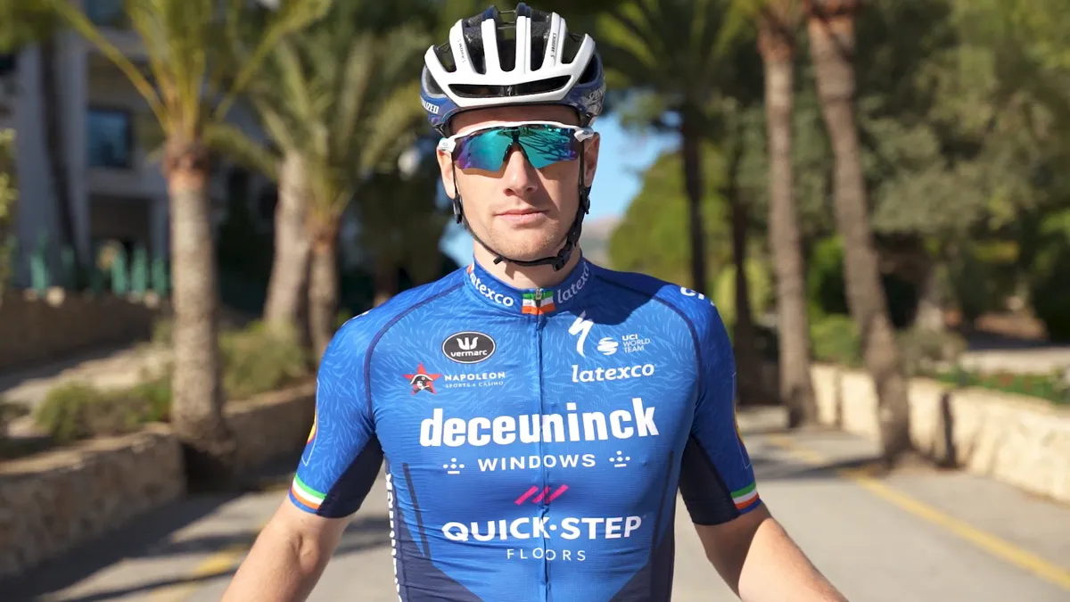


- I like it: A mid-tier kit for me, but with the double blue colours and the wolf hairs they look to have made more effort than most in the peloton. (DO)
- I don't: The Wolfpack thing already went too far when their riders started howling at dinner tables, but wolf hairs on the jersey? Makes my human skin crawl. (PF)
22: Alè BTC Ljubljana Cipollini
This one was bound to get people talking, and perhaps was designed so. As if it didn't stand out enough last year, the fluorescent yellow and red is made even more dazzling by the pattern on the front and rear.
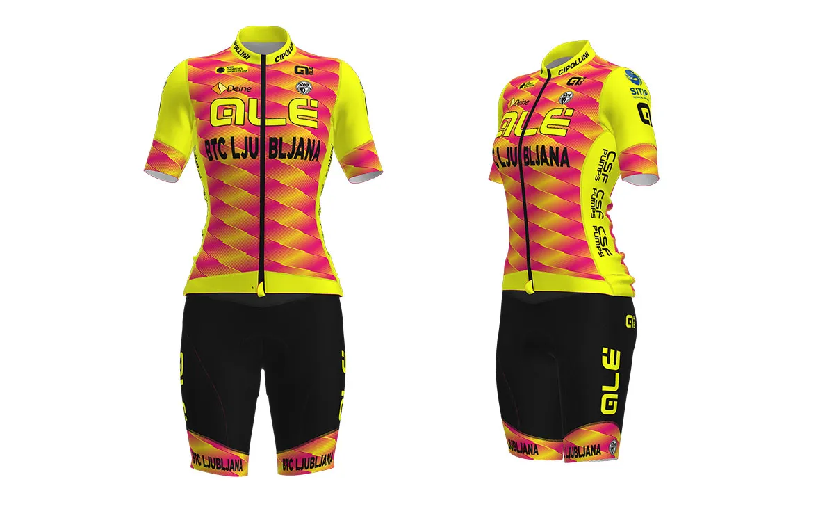
- I like it: The kaleidescope of red and yellow fluorescent colours in a blurry diamond pattern is mesmerizing, to the point of standing out quite well in the women's peloton. Who knows, maybe it will cause such a distraction to provide an edge in a sprint finish. (JT)
- I don't: This jersey takes high-vis to a whole other level. You’ll need your sunglasses to look at it. (KF)
21: Team DSM
One that will take time for adjustment. The twin stripes are still there but this is a big shift from the black-and-white and red-and-white that used to characterise the team formerly known as Sunweb.
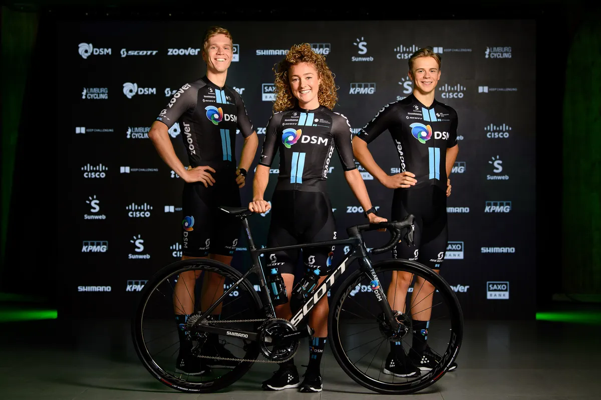
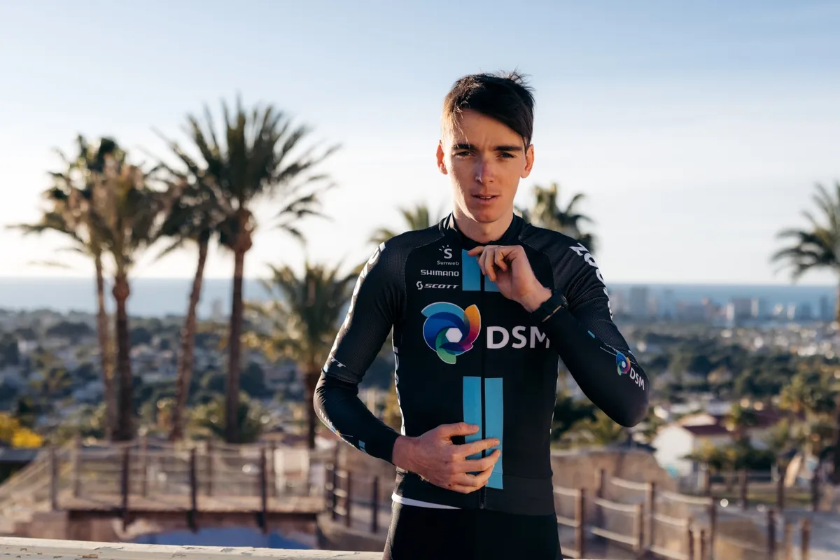
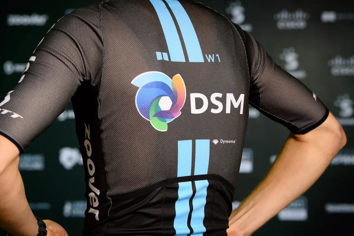
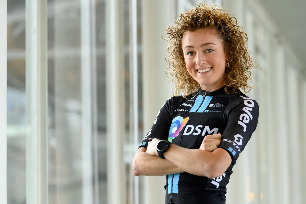

- I like it: High marks for distinct design with vertical blue stripes and colorful icon. The DSM logo looks like the shutter of a camera - could this be a way to illustrate speed? It certainly illustrates that the title sponsor, DSM, is headed in a new direction, moving from 'Dutch State Mines' to innovation with fabrics and sustainable living. (JT)
- I don't: Looking past the Team Sky vibes, I'm only getting IT software vibes. More specifically, my brain is wishfully reading 'MSN Messenger'. I get lost in the fading memories of post-school teenaged evenings - the stupid screen-names, the break-ups, the drama, even the glorious sound of the new message notification - but then I look up and this jersey still reads 'DSM', is still dull as dishwater, and all the kids are now singing sea shanties on TikTok. (PF)
20: Lotto Soudal
No change here for the Belgian team, who have men's and women's squads. The jersey will still change depending on where the team are racing - with Lotto sometimes above Soudal and vice versa - but it's the same red-black-white design.


- I like it: Not as striking as the red and white of the André Greipel era, but one of the peloton’s more stylish efforts. (BR)
- I don't: Red, white and black was the most popular colour palette 10 years ago, but the same jersey year in and year out is starting to wane on us. It's professional looking but there was more creativity in the jersey from 1985. (KF)
19: Cofidis
No change for the French team in their second WorldTour campaign, with a simple red-and-white colour scheme that has been around for nearly a quarter of a century.

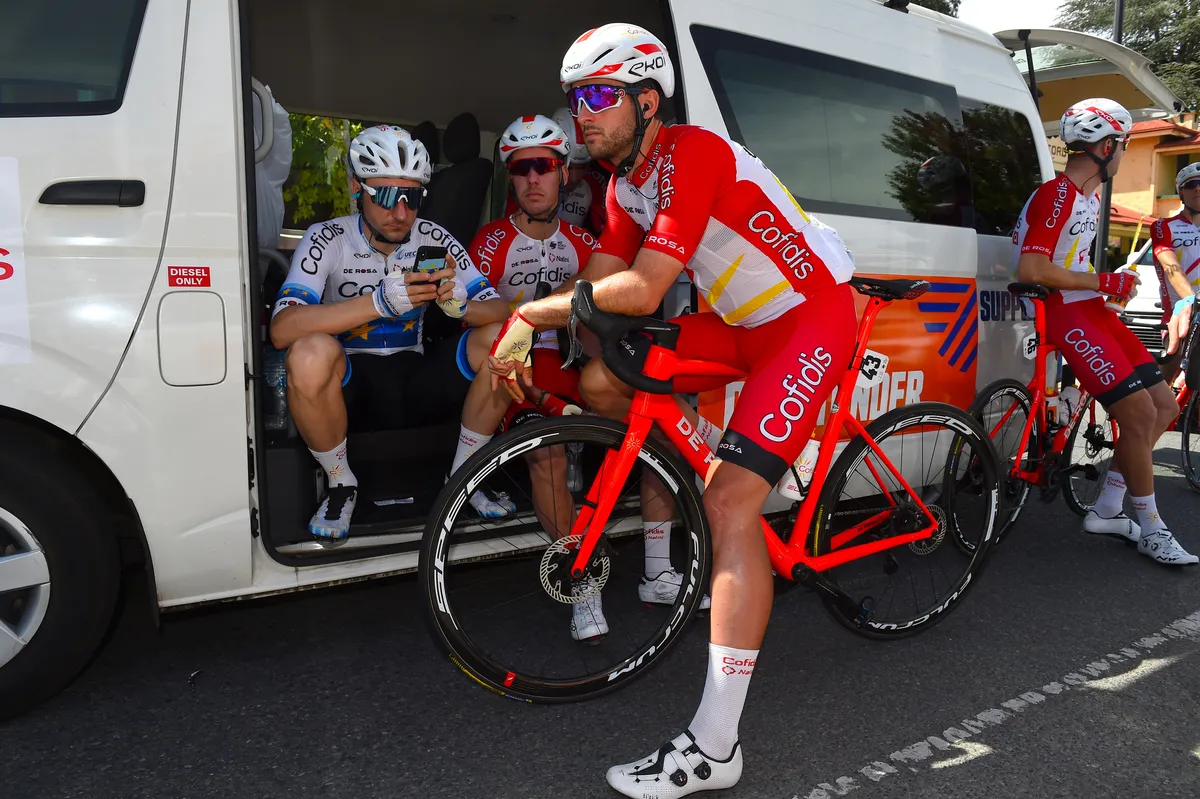

- I like it: Elegant and stands out in the peloton. (BR)
- I don't: Everyone goes on about AG2R's brown shorts but to me these red ones are 10 times more offensive. (PF)
18: UAE Team Emirates
It's all familiar enough from the UAE team, but the sleeves go back to black, with radiating red.


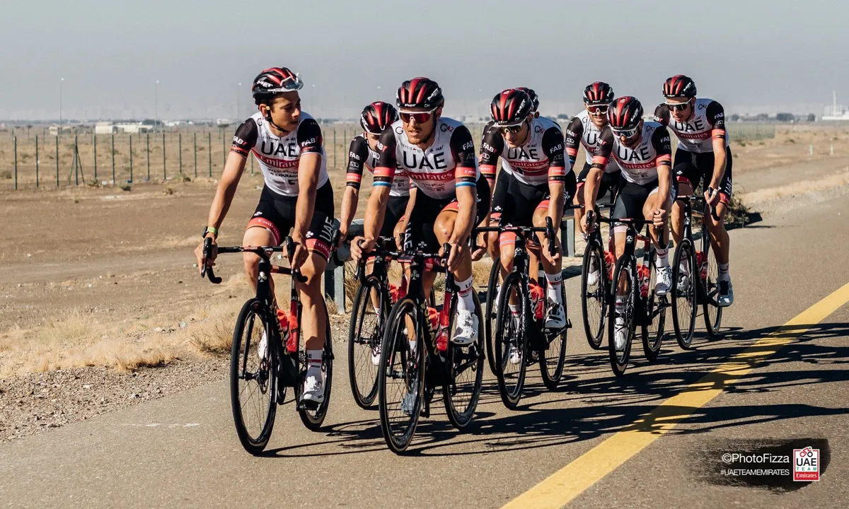
- I like it: The team are improving year on year and so is the kit. The gold touches add something extra, just like Marc Hirschi enriches their roster. (SF)
- I don't: A basic 'billboard' style jersey with not much invention about it, plus it has UAE scrawled across the top, so ethically not very nice either. (DO)
17: Israel Start-Up Nation
A significant overhaul for the team's second season in the WorldTour, when this kit will be worn by the likes of Chris Froome and Michael Woods. The white and sky blue jersey of last year has been replaced by a simpler two-section combination of white and navy.


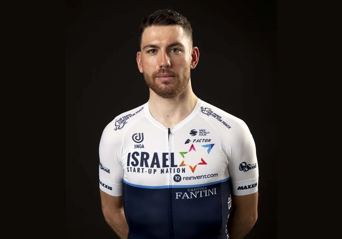
- I like it: After last year's inoffensive but forgettable design, this is a kit to match the intent shown with the new signings. It's not much fun, but it's smart, classy, and that blue line separating the navy from the white just sets the whole thing off. (PF)
I don't: The Israel Start-Up Nation roster has improved massively for 2021, sadly the kit has not. (SF)
16: Movistar
No change for the Spanish team in their second year with Alé, as they stick with an uncluttered sky blue jersey with just their title sponsor's logo on the front.
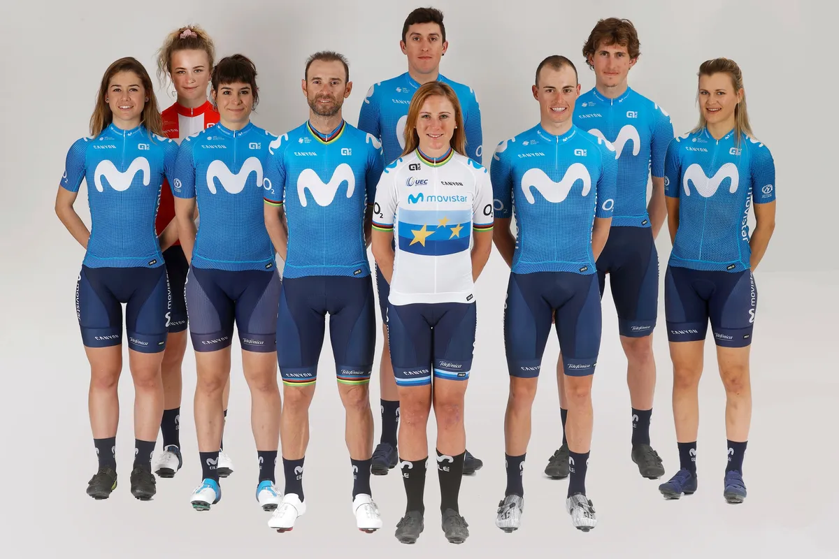


- I like it: Simple and clean. The large Movistar 'M' is easy to spot in the peloton, so big marks for branding. (JT)
- I don't: Full praise to a sponsor as committed to financially backing a professional cycling team as Movistar but the giant logo has always puzzled me. Is it an 'M', is it an inchworm, is it doodle art? It reminds me of drawing in bubble letters when I was a kid. (KF)
15: EF Education-Nippo
The last to reveal their kit, Jonathan Vaughters’ team had their tongues firmly in cheeks when coming up with this. Playing off the controversy generated by their duck-themed Palace collaboration at last year’s Giro d’Italia, they’ve gone out to create "the world’s most compliant kit", with designer’s workings showing everything being put in the right place. The annotations can only be seen close up, so from afar we see a jersey that retains the EF pink but does away with the psychedelic touches of previous years.


- I like it: EF-Education Nippo turned up fashionably late to the party but their new design was worth the wait. They’ve retained much of their 2020 look and have kept their patterns and design in check, despite the numerous new sponsors now on show. The subtle markings on the chest add some genuinely wonderful details to a kit that’s fast becoming iconic. The pink look also leaves them open to coming up with something entirely different when the Giro comes around. (DB)
- I don't: It’s just plain boring, and looks like the Giro leader’s jersey. (LW)
14: Ineos Grenadiers
No change for the British team after they launched a new design to go with a new team name ahead of last year’s Tour de France. The original crimson Ineos colours were replaced by a navy jersey with the logo of the Grenadier - the new 4x4 being promoted by the company - in red.


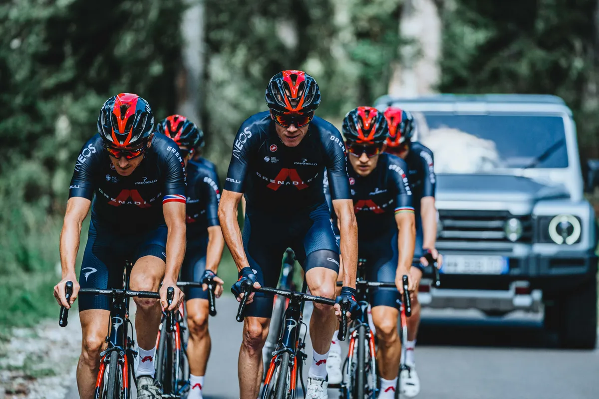


- I like it: Whatever you think of the British super-team, the dark blue and red Grenadier A logo is subtle and classy (SF)
- I don't: It's hard to see much evidence of a design here, but hey, at least it's not plain black or white. (DO)
13: Liv Racing
No playing safe for the Dutch team, who raced in orange as CCC-Liv last year. The only jersey to feature some sort of artistic imagery.
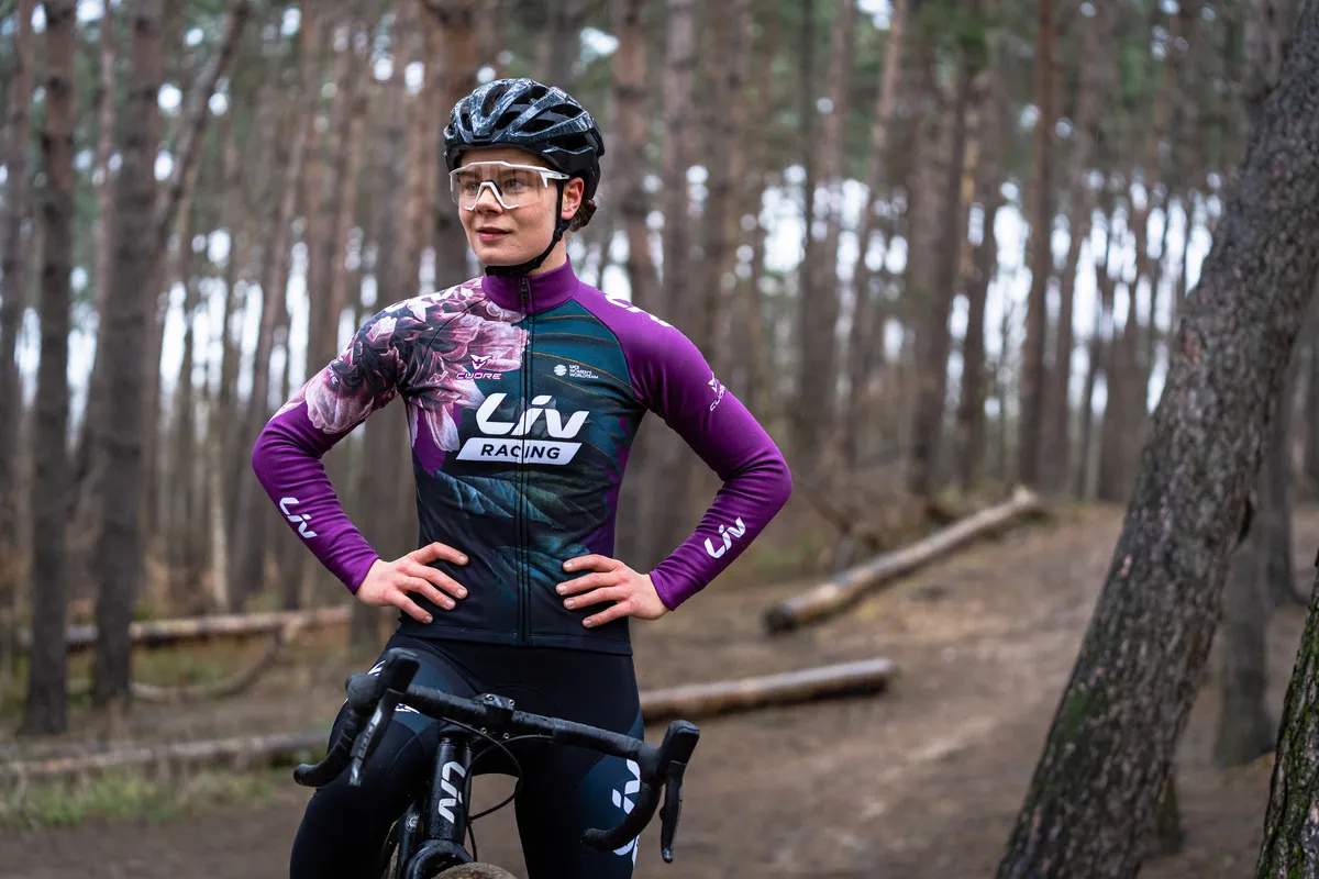


- I like it: Call the prominent hue aubergine, eggplant or just purple, but the "unapologetically feminine" flower-power motif will be recognizable in any breakaway or bunch sprint. Isn't that what a team jersey should do? And should be good for retail sales as a bonus. (JT)
- I don't: One of several kits that put one in mind of a mid-1990s goalkeeper’s jersey. Canyon-SRAM pull off the look with élan, but this is rather less successful. (BR)
12: Bahrain Victorious
With McLaren and Rod Ellingworth gone, the jersey subtly evolves from a bright orange into a deeper red, with the addition of Bahrain's oil company Bapco on the front.
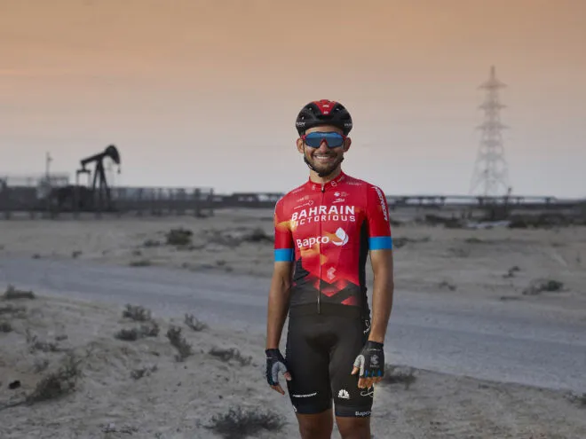
- I like it: This jersey is practically dripping with gasoline, and yet that wonderful electric blue trim makes my heart sing. (PF)
- I don't: Loses points for this 'Victorious' tag they've included. (DB)
11: FDJ Nouvelle-Aquitaine Futuroscope
The French team dial back the blue and red, departing from the current design of the men's team and harking back to FDJ kits of the early 2000s.


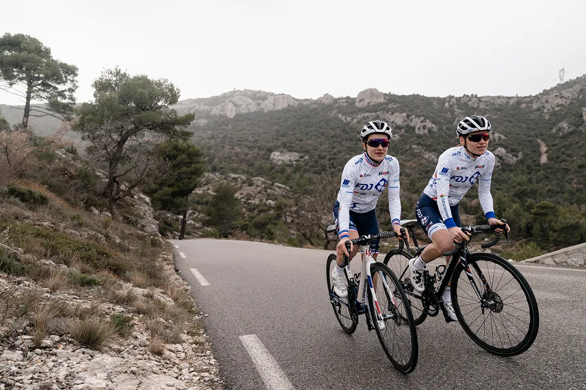


- I like it: The women's kit doesn't bother with the side panels that the men have kept with. Both kits are strong but the women’s jersey is more in line with the better FDJ outfits from a few years ago. In fact, this team has been consistently good with their kits ever since the men’s team formed in 1997. (DB)
- I don't: Is this last year's kit that has gone through a hundred washes? It has a grey hue that dampens the enthusiasm for the very visible giant FDJ logo. (SF)
10: Astana- Premier Tech
Light blue is still the colour for the Kazakh team, as Canadian company Premier Tech arrives as co-title sponsor, but they've gone for a new diamond pattern on the jersey, which fades to darker blue shorts.


- I like it: Years ago I pitched the idea of going behind the scenes with the team in order to detail how they recovered during Grand Tours in the evenings between stages. I basically wanted to run a story called Astanas in pyjamas. For some reason the idea was declined. Nice kit though. (DB)
- I don't: The addition of criss-crossing diamond-shaped pattern adds a new element to an otherwise monochromatic and duller shade of blue. The colour fade from light to dark is a step backwards into an out-dated trend. (KF)
9: Qhubeka Assos
It's a small victory that the South African team have a jersey to present at all, given how close they came to folding. After the stints as Dimension Data and NTT, it's back to their roots with a black-and-white design upon which the arms representing the Qhubeka charity have multiplied.
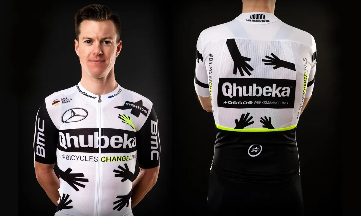

- I like it: Yes, it's black and white, but the neon yellow is a nice touch and the hands add something, even if they are a bit strange. (DO)
- I don't: Looks like the designer couldn’t decide between several options and so used them all. (BR)
8: Jumbo-Visma
A broadly similar look for the rising Dutch team. There's more black on the sleeves and rear pockets, which allows their hexagonal motif - a nod to the collective spirit of beehives - to stand out. Each rider also has a unique number on their kit to help with identification.


- I like it: Not a new look but the central stripe is a classic design while the colours are eye-catching and stand out. Plus, they have names on their helmets! (DO)
- I don't: The Dutch team have developed into one of the most powerful forces in the WorldTour, but yellow will simply never be an intimidating colour. (PF)
7: SD Worx
The old Boels Dolmans team get a complete image change as they shift to life as SD Worx. This was the marmite of the Cyclingnews newsroom, with three of us voting it as our number one kit, and three of us dumping it in the bottom three.


- I like it: The bright red and purple – a colour rarely seen in cycling – go well together in this eye-catching kit, while the fade also works. (DO)
- I don't: Reminiscent of a Windows XP wallpaper template. (BR)
6: Groupama-FDJ
Marc Madiot's team stick with the white-red-blue of the French flag as they hunt success with home stars Thibaut Pinot, Arnaud Démare, and David Gaudu. The main change sees the addition of a fanned pattern around the sides, replacing the previous straight lines.


- I like it: The new patterns lift a design that already carries a strong identity, and of course they score bonus points for their sponsor-free full-flag national champion's jerseys. (PF)
- I don't: The only design element that is interesting is one sleeve is red and one sleeve is blue. There is nothing that distinguishes this kit in the peloton. (JT)
5: Trek-Segafredo Men
Into the top five now, and Trek-Segafredo's men's squad are sticking with what brought them so much praise last year. Barring a slight re-shuffle of the minor sponsors, this is an unchanged kit from the American-Italian team, who have ditched the pinstripes for good.


- I like it: A simple, sober and timeless design. (BR)
- I don't: There's nothing wrong with it, and in years to come we might look back at this as one of the iconic kits from 2021, but it suffers in part because it’s not as good as the women’s kit. (DB)
4: Bora-Hansgrohe
This might not seem like much of a change, given they raced in a similar kit at the Tour de France last year, but their standard jersey in 2020 had black sleeves and chest. They're embracing the white in 2021, but they're sticking with the 'seafoam'-coloured chevron pattern that has proved popular in recent years.
They won our 'best kit' poll back in 2018, and it's another solid result for the German team.


- I like it: Minor changes to an already successful launch at the Tour de France in 2020 with a fade to black at the shorts but the teal colours and chevron pattern is still a winning combination. (KF)
- I don't: The permanent change from black to white is the right move, but I'd have preferred them just to stick with their 2020 Tour jersey, which had a lovely brushstroke effect on the green and didn't fade to black. (PF)
3: AG2R Citroën Team
This one set the internet alight when it dropped in December, but it turns out most of us are in the 'love' rather than 'hate' camp, and it sneaks onto our podium.
The familiar brown shorts are still in place, but the blue shades have been phased out on a white jersey that smacks you in the face with its oversized and diagonal sponsors. It's bold move - perhaps appropriate for their transition from small-scale French outfit to more of an ambitious and international team under the new backing of Citroën.


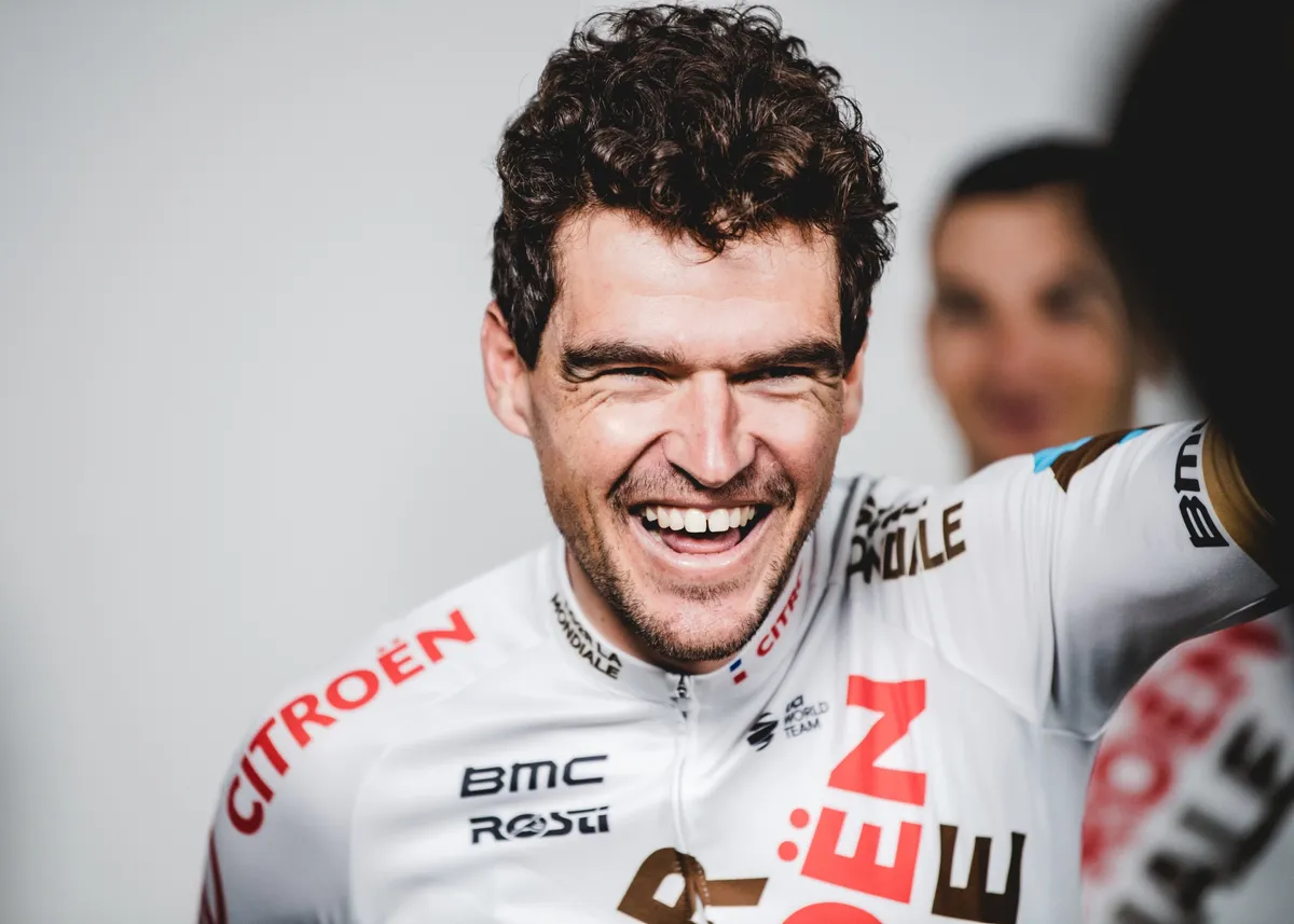
- I like it: A substantial upgrade on a kit that already stood out. It's bold, it's different and the finished product retains elements of the old design. It shouldn't work but it's one of the most refreshing kits in the peloton this year. (DB)
- I don't: It's a plain white jersey and the sponsor reads AG2R La Citroën Mondiale. All downhill since their 2014-15 kits. (DO)
2: Canyon-SRAM
The pre-race favourites - given how famous they've become for their kits - have to settle for second place. That's despite an update that retains the colour palette an overall identity in place since 2016, and adds an astronomical twist.
"A galaxy of possibilities," was how this kit, with its shooting stars and kaleidoscopic flashes of colour, was billed. Unfortunately, victory in the 2021 CN kit ranking belongs to a different galaxy.
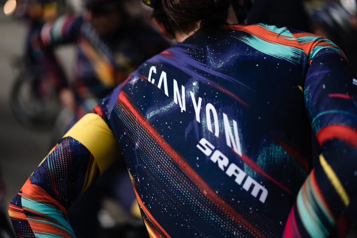

- I like it: Inspired by the galaxy. Imagine gazing up at the starry midnight sky and witnessing a clash of caped vigilante superheroes to the tune of the 1990s Beastie Boys hit Intergalactic. It’s like something out of a favourite comic book—a combination of colour, strength and inspiration. BAM! (KF)
- I don't: It's the best kit in pro cycling. I just wish I could afford it. (DB)
1: Trek-Segafredo Women
So here it is... (un)officially the best kit of 2021.
Trek-Segafredo's women's team have taken an already-popular 2020 kit and given it a re-fresh that has proved pretty much universally popular here at Cyclingnews.
The navy from the 2020 jersey has been moved onto the previously white sleeves, making way for a new sky blue torso with the familiar criss-cross pattern at the bottom.
"When designing the new kit, we thought about taking that foundation and spinning around the colors to see if we could get something fresh that updates it," says lead designer Brian Lindstrom.
"The light blue is borrowed from our Trek Factory Racing cyclocross team. It’s been in our brand repertoire for a few years now, so it felt like a natural progression."


- I like it: Mr lead designer wanted something fresh, and just looking at this jersey is like jumping into the Mediterranean on a still summer's day. The colours are perfectly balanced (don't underestimate the importance of that red 'S') and the brushed pattern works nicely once again. Alongside it, the men's kit - which I'd previously thought was excellent - looks thoroughly uninspiring. A triumph. (PF)
- I don't: Opportunity missed with the women's aqua blue colour of the new jersey. The criss-crossing shades of blue along the torso are not noticeable in the tuck position, only with hands up at the line, so I guess they plan to win a lot of races. The shorts are too plain, and could have used a pop of aqua or the criss-crossing pattern. (JT)

Patrick is an NCTJ-accredited journalist with a bachelor’s degree in modern languages (French and Spanish) and a decade’s experience in digital sports media, largely within the world of cycling. He re-joined Cyclingnews as Deputy Editor in February 2026, having previously spent eight years on staff between 2015 and 2023. In between, he was Deputy Editor at GCN and spent 18 months working across the sports portfolio at Future before returning to the cycling press pack. Patrick works across Cyclingnews’ wide-ranging output, assisting the Editor in global content strategy, with a particular focus on shaping CN's news operation.
